| CS631p -Human-Computer
Interaction |
| Spring 2001 |
| Lecture 6 |
Vision,
Graphic Design, & Visual Display
Purpose of
Graphic Design:
-
Design of effective visual presentations
-
Design of methods and techniques for producing and delivering
effective visual presentations
From Semantics
to Perception
-
HCI requires presentation of information so eye and brain
can see what presenter expects to be seen
-
Viewer does not perceive an image that conforms exactly to
image displayed on computer display
-
Visual sensations reaching eye are translated into perceptual
experience by brain through pattern recognition
-
What viewer perceives is based on brightness, contrast, flicker,
motion and color
Psychophysics
Study of psychological magnitude of physical stimulus:
-
Sensitivity range from minimum of just perceptible to maximum
of tolerable.
-
Relative discrimination sensitivity, measuring an observer's
ability to distinguish between two stimuli or to detect change in one stimulus
(a.k.a. JND - Just Noticeable Difference)
-
Ability to make absolute judgement of stimuli or of their
magnitude along some scale, expression as a number of distinguishable values.
-
Absolute judgements harder than relative judgements
Can only reliably identify on order of half dozen or
a dozen different absolute stimuli along a simple psychological dimension
such as brightness, hue, saturation, or value.
Visual
coding methods with number of levels that can be discerned
(Saunders and McCormick, 1993)
| Alphanumeric, single numerals |
10 |
| Alphanumeric, single letters |
26 |
| Color (hue of surfaces) |
9 |
| Color (H,S,B) |
24 (best , max 9) |
| Geometric Shapes |
15 (best, max 5) |
| Size of forms (eg squeares) |
5 (best, max 3) |
| Brightness of lights |
3 (best, max 2) |
| Color of Lights |
10 (best, 3 max) |
-
Brain attempts to organize sensory messages into meaningful
patterns and structures
Done by applying rules that summarize its model of how
the world is organized and the way it should appear in various contexts
-
Allows us to integrate incomplete information
 To quote Haber & Wilkinson (1982, IEEE CG&A):
"The human visual system is designed to produce organized
perception. Information consisting of a variety of such spatial features
as size, shape, distance, relative position, and texture is structured
by the mind to represent visual scenes. These spatial features are perceived
as properties of things, objects in the scene, and not merely as abstract
lines or surfaces. We do not perceive lines or unattached extents: we perceive
objects. As parts of each object are perceived together in on construction
- not as separate, independent, and free formed elements. And all the objects
are perceived as related to each other - near, afar, behind, adjoining,
and so forth
"
-
Context affects perceptions
-
What appears in adjoining parts of scene
-
What happened in immediate past
Example:
Questions to ask about visual representations by art historian Mary Acton
(from Learning to Look at Paintings)
-
Composition: What are the dominant lines of organization?
-
Space: Where are you in relation to the picture? Is
it much larger or smaller than you expected?
-
Form: Is there a three-dimensional feeling about the
picture? If so, where is it? Is it in some parts and not others?
-
Tone: What part does light and dark play in the picture?
-
Color: Is color part of the structure of the picture
or is it used more for expression?
-
Drawings: Can you see how many ways the artist has
used the medium?
-
Prints: How much variety can you see in the tones?
If it is a colored print, how much variety can you see in the shapes and
shades of color?
-
Setting: Are you seeing the painting, drawing or print
as it was intended to be seen or has its location and lighting been altered?
-
Subject matter: How does the subject matter, or lack
of it, affect the way you see the picture?
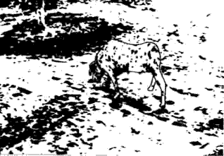
Sample Image (Copyright F.T.Marchese(2000)):

Graphic design
for effective visual communication
-
Bowman (1968) Graphic Communication:
-
Vocabulary of form elements: point, line, shape, value,
texture
-
Grammar of spatial organization: plane, multi-plane
and continuous
-
Idiom of volumetric perspective: parallel, angular,
and oblique
-
Syntax for phrasing the image: relationship, differentiation,
and emphasis
-
Visualization process in terms of three basic steps:
Concept, design, and production
-
How to show
-
What - natural appearances physical structure, and
organization of parts in relation to whole
-
How - physical measurements, system of flow in relation
to component parts, and process as a succession of related events.
-
How much - physical size, numerical quantity, trend
of increase or decrease, and division of parts in terms of whole
-
Where - natural area, environmental location, and
position with other individual elements.
Composition is
most crucial step
-
In a successful composition the elements of line, shape,
color, and texture come together to form a complete whole.
-
Artists have extensive control over composition:
-
They can arrange visual elements in still-life compositions
any way they see fit.
-
In landscape paintings, artists thin out foliage and move
about trees, bushes, streams and even mountains to strengthen cohesion
among elements.
-
In contrast, many geometrical elements inherent in the user
interface are visual cues in themselves, shuttling our eyes across the
image.
-
Additionally, the arrangement of light, selection of color,
and orientation of canvas can create a sense of space and form.
-
The shape of strokes and their orientations give an image
a sense of dynamics.
-
Diagonal lines create movement by leading the eye across
a picture.
-
An ordered arrangement of these lines creates a sense of
order and separation.
-
Vertical or horizontal lines strengthen the sense of order.
-
Curved lines create a sense of flow.
-
Triangles, squares, and rectangles are sensed as stable objects.
-
The selection of a canvas shape creates a sense of space.
-
Rectangular canvases laid horizontally used for landscape
paintings, create an experience of spatial expanse.
-
Vertical canvases, used for portraits, provide a feeling
of intimacy.
-
Within the canvass boundaries a relationship is set up between
object and background. Placing a black line around the perimeter more clearly
defines the positive space occupied by the object and the unoccupied
negative
space. A tension is created between the positive and negative spaces
that posits the perception of the object's shape.
Typography at
the interface
-
Most basic element of graphic design
A line of 12 point type, Times
Roman serif font
A line
of 12 point type, Helvetica-like sans serif font
A
line of 12 point type, Helvetica-like Bold
A
line of 12 point type, Helvetica-like italic
A
line of fixed-width type
Type
with normal letter spacing
Type
with condensed letter spacing
Type
withn expanded letter spacing
-
On screen high contrast anti-aliased fonts
Color
in interface
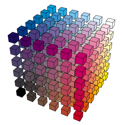
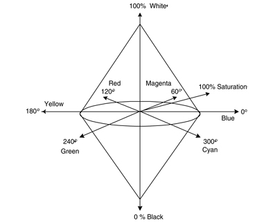
Color Models
-
RGB
Primary Color Combinations
|
Color
|
Red
|
Green
|
Blue
|
|
Black
|
0
|
0
|
0
|
|
Red
|
1
|
0
|
0
|
|
Green
|
0
|
1
|
0
|
|
Blue
|
0
|
0
|
1
|
|
Magenta
|
1
|
0
|
1
|
|
Yellow
|
1
|
1
|
0
|
|
Cyan
|
0
|
1
|
1
|
|
White
|
1
|
1
|
1
|
-
HLS
-
CIE (Perceptual Color Space)
Depends on:
-
Object's Spectral Color Characteristics
-
Light Source's Spectral Characteristics
-
Display's Spectral Characteristics


Color
Lists
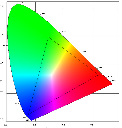
Six Colors of Maximum
Contrast
|
Name |
x
|
y
|
Y
|
R
|
G
|
B
|
|
1
|
Reddish
Purple |
0.346
|
0.183
|
25.69
|
0.756
|
0.000
|
0.712
|
|
2
|
Blue |
0.150
|
0.070
|
8.15
|
0.000
|
0.000
|
1.000
|
|
3
|
Yellowish
Gray |
0.462
|
0.457
|
58.57
|
0.908
|
0.529
|
0.001
|
|
4
|
Yellowish
Green |
0.268
|
0.588
|
65.59
|
0.000
|
1.000
|
0.000
|
|
5
|
Red |
0.628
|
0.346
|
26.26
|
0.997
|
0.000
|
0.000
|
|
6
|
Bluish
Gray |
0.207
|
0.320
|
72.00
|
0.000
|
0.975
|
1.000
|
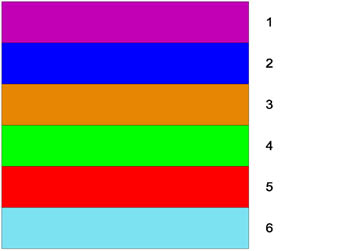
Twenty-two
Colors With Maximum Contrast
|
Name |
x
|
y
|
Y
|
R
|
G
|
B
|
|
1
|
White |
0.313
|
0.329
|
90
|
0.900
|
0.900
|
0.900
|
|
2
|
Black |
0.313
|
0.329
|
0.94
|
0.009
|
0.009
|
0.009
|
|
3
|
Vivid
Yellow |
0.418
|
0.487
|
85
|
0.955
|
0.913
|
0.000
|
|
4
|
Strong
Purple |
0.297
|
0.214
|
14
|
0.236
|
0.077
|
0.334
|
|
5
|
Vivid
Orange |
0.545
|
0.4
|
36
|
0.911
|
0.183
|
0.002
|
|
6
|
Vivid
Light Blue |
0.257
|
0.267
|
56
|
0.412
|
0.566
|
0.991
|
|
7
|
Vivid
Red |
0.6
|
0.33
|
11
|
0.412
|
0.000
|
0.017
|
|
8
|
Grayish
Yellow |
0.368
|
0.37
|
46
|
0.589
|
0.432
|
0.270
|
|
9
|
Medium
Gray |
0.313
|
0.329
|
24
|
0.240
|
0.240
|
0.240
|
|
10
|
Vivid
Green |
0.27
|
0.481
|
19
|
0.033
|
0.269
|
0.060
|
|
11
|
Strong
Purplish Pink |
0.372
|
0.286
|
40
|
0.765
|
0.245
|
0.467
|
|
12
|
Strong
Blue |
0.18
|
0.186
|
13
|
0.008
|
0.138
|
0.464
|
|
13
|
Strong
Yellowish Pink |
0.429
|
0.344
|
43
|
0.856
|
0.282
|
0.244
|
|
14
|
Strong
Violet |
0.236
|
0.174
|
10
|
0.113
|
0.062
|
0.360
|
|
15
|
Vivid
Orange Yellow |
0.49
|
0.43
|
48
|
0.911
|
0.365
|
0.014
|
|
16
|
Strong
Purplish Red |
0.428
|
0.263
|
15
|
0.422
|
0.037
|
0.178
|
|
17
|
Vivid
Greenish Yellow |
0.43
|
0.475
|
63
|
0.788
|
0.644
|
0.008
|
|
18
|
Strong
Reddish Brown |
0.581
|
0.35
|
7
|
0.232
|
0.012
|
0.008
|
|
19
|
Vivid
Yellow Green |
0.359
|
0.527
|
40
|
0.252
|
0.509
|
0.000
|
|
20
|
Deep
Yellowish Brown |
0.46
|
0.408
|
7
|
0.126
|
0.054
|
0.013
|
|
21
|
Vivid
Reddish Orange |
0.57
|
0.366
|
24
|
0.731
|
0.070
|
0.018
|
|
22
|
Dark
Olive Green |
0.319
|
0.423
|
3.6
|
0.024
|
0.043
|
0.016
|
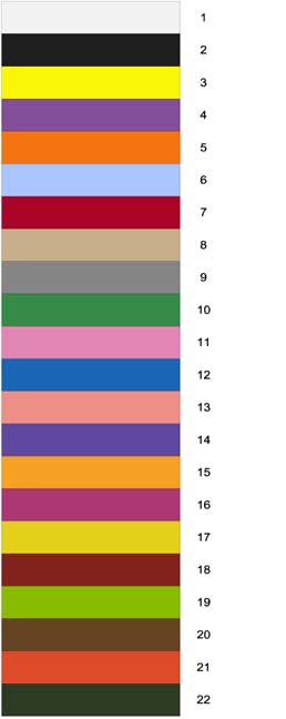
Best and Worst
Color Combinations for Text, Lines, and Shapes*
| |
Thin Lines
and Text
|
Thick Lines
and Text
|
|
Background
|
Best
|
Worst
|
Best
|
Worst
|
|
White
|
blue,
black, red |
yellow,
cyan |
black,
blue, red |
yellow,
cyan |
|
Black
|
white,
yellow |
blue,
red, magenta |
yellow,
white, green |
blue,
magenta |
|
Red
|
yellow,
white, black |
magenta,
black, green, cyan |
black,
yellow, white, cyan |
magenta,
blue, green, cyan |
|
Green
|
black,
blue, red |
cyan,
magenta, yellow |
black,
red, blue |
cyan,
magenta, yellow |
|
Blue
|
white,
yellow, cyan |
green,
red, black |
yellow,
magenta, black, cyan, white |
green,
red, black |
|
Cyan
|
blue,
black, red |
green,
yellow, white |
cyan,blue,
black, magenta |
yellow,
green, white |
|
Magenta
|
black,
white, blue |
green,
red, cyan |
blue,
black, yellow |
cyan,
green, red |
|
Yellow
|
red,
blue, black |
white,
cyan |
red,
blue, black |
white,
cyan, green |
* Adapted from [Thorell 1990]. Based on color selection experiments.
Data in each list is given in decreasing order of quality.
Effective Colors
for 3D Design
|
3D Effects
|
Layers
of Color |
|
Number of Colors
|
Farthest
Layer to Nearest Layer |
|
2
|
blue
- red |
|
3
|
blue
- green/yellow - red |
|
4
|
blue
- green - yellow - red |
|
5
|
blue
- green - yellow - orange - red |
|
6
|
purple
- blue - green - yellow - orange - red |
Process Control
Applications
|
To Show:
|
Use: |
|
Concentration
Levels
|
|
|
Low
|
Desaturated
Colors |
|
High
|
Saturated
Colors |
|
Life
Support Status
|
|
|
OK
|
Blue/Green/White |
|
Caution
|
Yellow |
|
Emergency
|
Red
(flashing option) |
|
Direction
|
|
|
In
|
Red |
|
Out
|
Blue |
Measurement Applications
Inspection/
Quality Graphs on Black Background
|
For:
|
Use: |
|
Grids
|
gray |
|
Data
Points
|
yellow |
|
Variance
or error bars
|
blue
(medium) |
|
Out of
Spec data
|
red |
|
Labels
:
|
|
|
x
|
magenta |
|
y
|
green |
|
z
|
cyan |
Color Text
| WebSafe Palette |
| Code |
Color |
Code |
Color |
Code |
Color |
Code |
Color |
Code |
Color |
Code |
Color |
| 000000 |
|
000033 |
|
000066 |
|
000099 |
|
0000cc |
|
0000FF |
|
| 003300 |
|
003333 |
|
003366 |
|
003399 |
|
0033cc |
|
0033ff |
|
| 006600 |
|
006633 |
|
006666 |
|
006699 |
|
0066cc |
|
0066ff |
|
| 009900 |
|
009933 |
|
009966 |
|
009999 |
|
0099cc |
|
0099ff |
|
| 00cc00 |
|
00cc33 |
|
00cc66 |
|
00cc99 |
|
00cccc |
|
00ccff |
|
| 00FF00 |
|
00ff33 |
|
00FF66 |
|
00ff99 |
|
00FFCC |
|
00FFFF |
|
| 330000 |
|
330033 |
|
330066 |
|
330099 |
|
3300cc |
|
3300ff |
|
| 333300 |
|
333333 |
|
333366 |
|
333399 |
|
3333cc |
|
3333ff |
|
| 336600 |
|
336633 |
|
336666 |
|
336699 |
|
3366cc |
|
3366ff |
|
| 339900 |
|
339933 |
|
339966 |
|
339999 |
|
3399cc |
|
3399ff |
|
| 33cc00 |
|
33cc33 |
|
33cc66 |
|
33cc99 |
|
33cccc |
|
33ccff |
|
| 33ff00 |
|
33FF33 |
|
33FF66 |
|
33ff99 |
|
33FFCC |
|
33FFFF |
|
| 660000 |
|
660033 |
|
660066 |
|
660099 |
|
6600cc |
|
6600ff |
|
| 663300 |
|
663333 |
|
663366 |
|
663399 |
|
6633cc |
|
6633ff |
|
| 666600 |
|
666633 |
|
666666 |
|
666699 |
|
6666cc |
|
6666ff |
|
| 669900 |
|
669933 |
|
669966 |
|
669999 |
|
6699cc |
|
6699ff |
|
| 66cc00 |
|
66cc33 |
|
66cc66 |
|
66cc99 |
|
66cccc |
|
66ccff |
|
| 66FF00 |
|
66FF33 |
|
66ff66 |
|
66ff99 |
|
66ffcc |
|
66FFFF |
|
| 990000 |
|
990033 |
|
990066 |
|
990099 |
|
9900cc |
|
9900ff |
|
| 993300 |
|
993333 |
|
993366 |
|
993399 |
|
9933cc |
|
9933ff |
|
| 996600 |
|
996633 |
|
996666 |
|
996699 |
|
9966cc |
|
9966ff |
|
| 999900 |
|
999933 |
|
999966 |
|
999999 |
|
9999cc |
|
9999ff |
|
| 99cc00 |
|
99cc33 |
|
99cc66 |
|
99cc99 |
|
99cccc |
|
99ccff |
|
| 99ff00 |
|
99ff33 |
|
99ff66 |
|
99ff99 |
|
99ffcc |
|
99ffff |
|
| cc0000 |
|
cc0033 |
|
cc0066 |
|
cc0099 |
|
cc00cc |
|
cc00ff |
|
| cc3300 |
|
cc3333 |
|
cc3366 |
|
cc3399 |
|
cc33cc |
|
cc33ff |
|
| cc6600 |
|
cc6633 |
|
cc6666 |
|
cc6699 |
|
cc66cc |
|
cc66ff |
|
| cc9900 |
|
cc9933 |
|
cc9966 |
|
cc9999 |
|
cc99cc |
|
cc99ff |
|
| cccc00 |
|
cccc33 |
|
cccc66 |
|
cccc99 |
|
cccccc |
|
ccccff |
|
| ccff00 |
|
ccff33 |
|
CCFF66 |
|
ccff99 |
|
ccffcc |
|
ccffff |
|
| FF0000 |
|
FF0033 |
|
ff0066 |
|
ff0099 |
|
ff00cc |
|
FF00FF |
|
| ff3300 |
|
ff3333 |
|
ff3366 |
|
ff3399 |
|
ff33cc |
|
ff33ff |
|
| ff6600 |
|
ff6633 |
|
ff6666 |
|
ff6699 |
|
ff66cc |
|
ff66ff |
|
| ff9900 |
|
ff9933 |
|
ff9966 |
|
ff9999 |
|
ff99cc |
|
ff99ff |
|
| ffcc00 |
|
ffcc33 |
|
ffcc66 |
|
ffcc99 |
|
ffcccc |
|
ffccff |
|
| FFFF00 |
|
FFFF33 |
|
FFFF66 |
|
ffff99 |
|
ffffcc |
|
FFFFFF |
|
The Websafe palette, with hexadecimal
color codes on the left and a sample of the color on the right. Color codes
caps are also part of the Reallysafe palette. http://www.webreference.com/html/reference/color/websafe.html
Color Commandments
(Adapted from Aaron Marcus (1986)
-
Use a maximum
of five, plus or minus two, colors.
In a classic1956 paper, the Harvard University psychologist
George Miller reported that when it was necessary to remember the meaning
of things (e.g. color, shapes, objects), humans could only maintain seven
plus or minus two simultaneous associations in memory. Marcus has argued
further that when color is at issue, less is more. Novice viewers should
be subjected to four distinct colors; with experts five is appropriate.
-
Use foveal and
peripheral colors appropriately.
The blue cones are the least numerous of the color receptors.
Do not use blue for small text, lines, or small shapes. The eye will have
difficulty in discriminating these shapes. Blue should be used for backgrounds.
The center of the visual field is most sensitive to red and green. These
colors should be viewed at an image's center. For these colors to be recognized
at the periphery, they must be enhanced by size change or blinking.
-
Use colors that
are less likely to shift their saturation and lightness when the areas
they fill change size.
As colored areas change size, they appear to change in
lightness and saturation. This causes a more pronounced interaction with
the background, producing optical illusions. Under dim viewing conditions
text, thin lines, and small shapes should be drawn with light colors, such
as white or yellow. Backgrounds should be dark colors, such as blue, green,
or dark gray. On a light surface, such as white paper, use dark colors
(blue or black) for text, thin lines and small shapes.
-
Do not use highly
saturated, spectrally extreme colors simultaneously.
Strong contrasts between red/green, blue/yellow, green/blue
and red/blue create vibrations, illusions of shadow and afterimages. If
spectral extremes are required, use desaturated colors that are created
by adding white to the color.
-
Use familiar,
consistent color coding.
Color coding is influenced by culture, profession, and
application. In the United States yellow represents cowardice, while in
Japan it stands for grace or nobility. Yellow represents caution to process
control engineers and jaundice to health care professionals. In western
cultures, warm colors refer to action and spatial closeness. Cool colors
refer to status, background information and spatial remoteness. Gray, white,
and blue refer to neutrality.
-
Use consistent
color codes.
Visually associate related objects by assigning them
the same color (e.g. all hydrogen bonds orange, or sulfur-sulfur bonds
yellow). The observer detects relatedness by color association through
space and over time. Use similar background colors in related areas. Do
not use the same colors for process coding and object coding unless they
are related.
-
Use spectral
colors or shading to encode change.
The change from blue to green in the spectrum is smaller
than the change from blue to orange. Hence, for continuous change use the
ordered spectrum or a single hue graduated in saturation. For discrete
change, where there are large or abrupt changes in a variable, large hue
changes are required.
-
Use high lightness,
high saturation colors to draw attention.
Bright colors should be used for danger signals, attention
grabbers, and reminders. High saturation red or blue elicits a faster response
than yellow. Use brighter colors for older viewers. Under long viewing
periods, younger viewers accommodate to the brightness levels. This means
that some increase may be required as viewing time increases.
-
Use redundant
coding of shape as well as color.
For color deficient viewers, a color/shape encoding enhances
recognition. Under various ambient light conditions, perceived screen colors
will differ in hue, saturation, and lightness. Hence, redundant coding
of shape and color help maintain recognition.
-
Use color to
enhance black and white information.
Color is superior to black and white when processing
time and emotional response is important. However, the ability to interpret
visual information is not color dependent, although it enhances
memorability.
Pictures, Symbols,
Signs, and Icons
Arnheim (1969):
"An image serves merely as a sign to the extent to which
it stands for a particular content without reflecting its characteristics
visually
images are pictures to the extent to which they portray things
located at a lower level of abstractness than they are themselves. They
do their work by grasping and rendering some relevant qualities - shape,
color, movement of the objects or activities they depict
an image acts
as a symbol to the extent to which it portrays things which are at a higher
level of abstractness than is the symbol itself
"
Icons - images representing commands, objects,
states, or results.
Analysis of icons (three dimensions):
-
Semantic - relationship of a visual image to a meaning.
How well does symbol represent the message?
-
Syntactic - relationship of one visual image to another
-
Pragmatic - the relationship of a visual image to
the user.
Principles for
Effective Visualization
Tufte - goal - graphical excellence - "the efficient communication
of complex quantitative ideas". See:
E.D. Tufte, The Visual Display of Quantitative Information
(1983)
________, Envisioning Information (1990)
________, Visual Explanations (1997)
Information
Visualization Software
AVS: http://www.avs.com
Techplot: http://www.amtec.com
VTK:
http://www.kitware.com
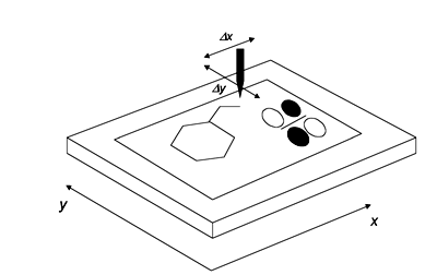
Display Methods
and Techniques
Rendering:
2D:
-
Vector (points and lines)
Plotter Model
-
Raster (pixels and scanlines)
-
bmp, tiff, tga, png, pict, tiff
3D:

Graphics API: http://www.opengl.org
Rendering Software:
POVRAY: http://www.povray.org