Proceedings of the Working Conference on
Advanced Visual Interfaces: AVI 2002 (Trento, Italy, May), ACM Press, pp.103-107.
Op-Glyph:
A Tool for Exploring Op Art Representation of Height and Vector Field Data PDF
Francis T. Marchese
Pace University
Department of Computer Science
New York, NY 10038
212 346 1803
ABSTRACT
We
report our experiences with application of the optical art techniques of Victor
Vasarely and Bridget Riley to visualization of height field and vector field
data. The bold use of color and simple form in Op Art engages the preattentive
processing ability of the human visual system, facilitating a nearly instantaneous
perception of image properties without the need for extended scrutiny of
component parts. A software system called Op-Glyph was constructed to
illustrate the Op Art method for data visualization, providing a user with
extensive control over a visual representation’s primitives, including shape,
size, and color. Initial results suggest that this glyph-based approach to data
visualization may be a viable alternative or complement to more complex representation
schemes, particularly in situations where there are limited processing or
graphical capabilities, such as with PDAs.
Categories and Subject Descriptors
H.5.2 [Information
Interfaces and Presentation]: User Interfaces – screen design. I.3.8 [Computer
Graphics]: Applications.
General Terms
Human Factors.
Keywords
Information visualization,
glyph, optical art, non-photorealistic rendering.
1. INTRODUCTION
The optical artists Victor Vasarely
[10] and Bridget Riley [1] are noted for their abstract imagery composed of
boldly rendered simple shapes. Whether reproduced in a catalogue, installed as
an architectural mural, or exhibited in an art gallery, these images maintain
their visual integrity and strong communication ability, despite mammoth
changes in scale. This concept of optical scalability may be leveraged for
creating visualizations that are interpreted on computer displays at the visual
extremes from low resolution PDAs to video walls. Thus, the purpose of this
research was to investigate optical art methods for the display of height field
and vector field data. During the course of this research, a program called
Op-Glyph was created that allows a user to quickly explore a wide variety of
optical art representations of visualization data.
The next section contains the background to this
research. A description of Op-Glyph’s capabilities is given in Section 3. Discussion
of results follows in Section 4. Finally, Section 5 presents suggestions for
future work.
2. BACKGROUND
The goal of optical art (Op art) is
to invoke an instantaneous response from the viewer [16]. It does so by playing
into two perceptual processes: preattention and Gestalt. Preattentive
processing is a low-level component of the visual system that detects visual
elements without the need to focus attention. Gestalt is German for form, and
refers to the visual systems innate ability to perceive multiple objects as a
group [19].
Gestalt perceptual cues are
proximity, similarity, and good figure. Objects that satisfy the proximity cue
are near to one another, and tend to form a group. Similar things tend to group
and thus stimulate the similarity cue. Good figure is a cue that allows
prediction of a total entity with a minimum amount of information stimuli.
Goodness means that a visual entity is perceived as complete, its elements
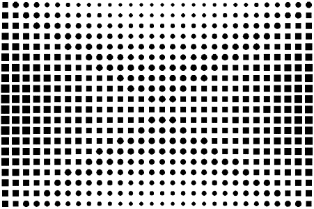
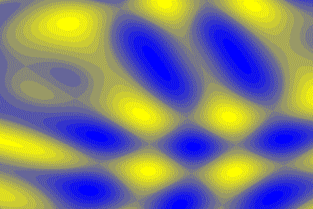
share a common fate, or are related by symmetry. Figure 1 shows an image in the
style of Victor Vasarely that demonstrates the Gestalt principles. Clusters of
parallelograms and rotated squares are perceived as entities apart from the
uniform grid of squares because similar objects in close proximity are discernable
as rectangular shapes.
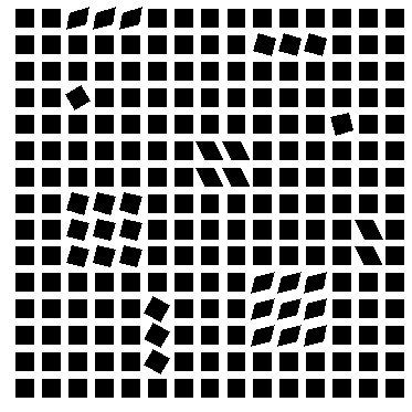
Figure 1. Image in the style of
Victor Vasarely
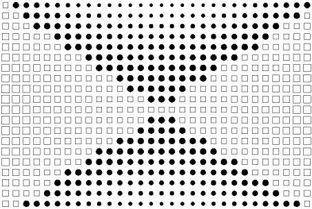
Healy and coworkers take this
visualization process one step further by testing whether image recognition can
be performed preattentively, in less than 200ms. This is the time required for
a single glance, in which the visual system cannot change its focus of
attention [6]. Preattentive cues are visually unique features such as color or
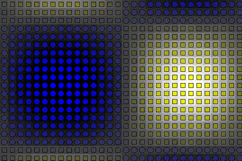
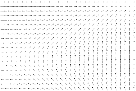
shape that segment an image into perceptual groups. For example, Figure 2a
shows an image of a grid of oriented square glyphs. Because there is no unique
feature with which to segment the image, the perceptual system consolidates the
glyphs into arcs. Figure 2b shows black and white used to segment this image.
The boundary that materializes on a portion of the mathematical surface represents
where the surface’s positive (white) region transitions into its negative
(black) region. As a result, the region of nodal transition is observed. A
similar result could have been effected by using two different glyphs.
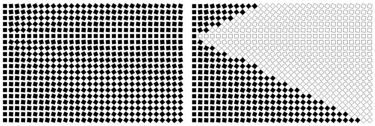
|
Figure 2a Single glyph representation of height
field. |
Figure 2b Figure 2a augmented with two
shades. |
Visual features that have been shown
to be preattentively pro-cessed are hue, orientation, intensity, size,
curvature, and line length. Healy and coworkers have built a visualization tool
to demonstrate that preattentive processing is particularly useful for
multivariate data analysis of static images and real-time display. They have
found that simple glyphs augmented with color facilitate rapid and accurate
detection of boundaries, assessment of shape, and quantitative estimation [6].
The research findings of these
authors’ may be applied naturally to visualization of height field and vector
data. In particular, their concepts combined with the design principles of Op
art are useful for the representation of low-density height field data
displayed on tiny low-resolution, less powerful PDAs. Moreover, the move toward
distributed collaborative visualization environments in which PDAs are growing
in importance [2, 13, 15], creates opportunities for alternative artistic
representations.
Artistic approaches to information
visualization have recently appeared. Healy, et al have summarized much of the
work in the SIGGRAPH 2001 Course Notes [8]. Researchers have applied expressive
(or non-photorealistic) rendering methods [5] such as impressionistic painting
and line drawing to visualize surfaces [9], volumes [18], and flow fields [11].
Use of glyphs for multivariate
display continues to be an area of active research [3, 4, 12, 17, 20]. 2D and
3D glyphs have been applied to analysis of scanning electron microscope images
[20], hydrodynamic simulations [3], document analysis [4], and automobile
development [12]. Healey has taken a painterly approach to glyph
representations of multivariate data with an eye toward the glyphs creating a
coherent image [7]. Finally, Manchester and coworkers have analyzed genomic
data with a multivariate charting method they call Vasarely Charts [14]. Their method uses a small grid of rectangular
cells, each occupied by a circular glyph.
The shades of cells and glyphs vary, based on the statistical nature of
the data. The resultant images look similar to some of Vasarely’s artwork.
3. SOFTWARE SYSTEM
Op-Glyph was written as a Java
applet. It is designed to render height field and vector field data as glyphs
and solid contours. The program makes no assumptions about how data is
represented. The user controls glyph-type and attributes such as size, body and
edge color, and degree of shading.
The program’s capabilities will be
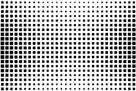
demonstrated by working through example data. All data used was sampled in two
ways. Surface data were generated at a 900 x 600 pixel resolution and gridded
data for glyph illustration were sampled at a resolution of 30 x 20 and
rendered in patches of 30x30 pixels.
|
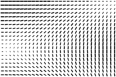
Figure 3a. z = x2 – y2 in 32 shades of gray |
Figure 3b. Square glyph rendering
scaled by surface height. |
|
Figure 3c. Two glyph rendering scaled
by height |
Figure 3d. Figure 3c augmented with
second shade. |
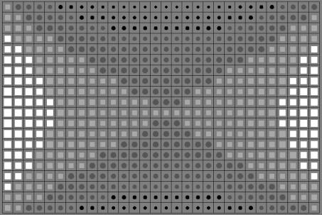
|
Figure 3e. Previous image rendered in
four shades of gray a 50% gray background and black gridlines |
Figure 3f. Grid of 30x20 patches
rendered in 32 shades of gray. Glyphs in 50% gray superimposed over surface
with gray gridlines. |
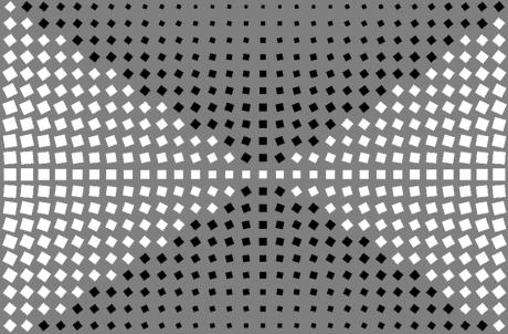
Figure 3a shows a color contour
surface of the function z = x2
– y2 rendered in 32 shades of gray. A saddle point is clearly
visible. Figure 3b shows the same function using gridded data employing a
square glyph scaled over the function’s height values with smallest and largest
glyphs representing minima and maxima, respectively. The saddle point is
obscured, but the general curvature of the surface can be sensed. A second
glyph may be added to emphasize the saddle point and nodal plane transition.
This is seen in Figure 3c where a circle has been used to represent data values
below zero. The saddle point is now visible, but could be emphasized further by
adding a second shade. Figure 3d shows positive function values rendered with
white squares and negative function values with solid black circles. The two
sections of the surface and saddle point are now clearly visible.
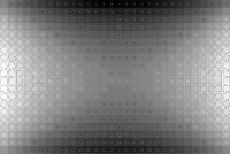
Glyph representation of a surface
may be enhanced in two ways. The first is to increase the number of shades.
Glyph shading is increased to four shades of gray in Figure 3e. Edge color has
changed from black to 50% gray. Two lighter shades represent values above and
two darker shades represent values below zero. A background of 50% gray has
been added to emphasize the nodal plane. A black grid has been added as well.
Surface structure begins to appear, but more shades of gray will convey a
better sense of surface curvature. Figure 3f shows the surface rendered with at
the grid resolution of 30x20 patches in 32 shades of gray. Superimposed upon
these patches are the scaled glyphs rendered in 50% gray.
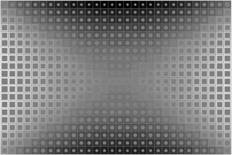
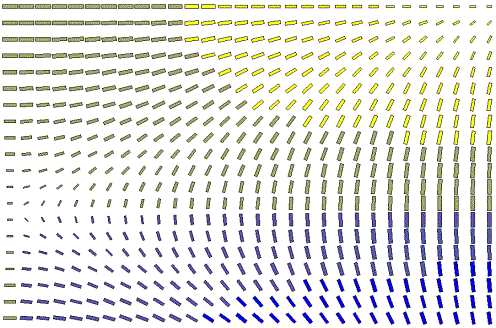
Op-Glyph allows the use of color as
well (Plate 4). Two glyphs rendered in 32 shades from yellow to blue are superimposed
over the height field of z = sin(x)cos(y) rendered as shaded
patches in 32 shades of gray from white to black in Plate 4a. Plate 4b shows
the z = x2 – y2 surface
rendered with patches in 8 shades of gray and two glyphs imaged in red and
blue.
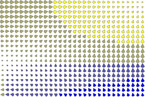
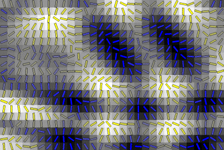
A better sense of surface curvature
is communicated using oriented glyphs. Taking the first derivative of the
function with respect to x and y produces two components of a vector
that orients each glyph. Figure 5a shows an oriented glyph representation of
the z= x2 – y2 surface
rendered in black and white over a gray background. Glyph orientation gives a
clear representation of surface shape. Figure 5b shows this image augmented
with 16 shades of gray for the glyphs, gray outlines, and 256 shades of gray
for the patches. Here, additional visual detail does not convey any
substantially more important information.
|
Figure 5a.
Oriented square glyph rendering of z =
x2 – y2 scaled by surface height. White designates
positive values black negative. |
Figure 5b.
Glyph representation superimposed over 256 shaded gray patches. Glyphs in 16
shades from white to black with gray edges. |
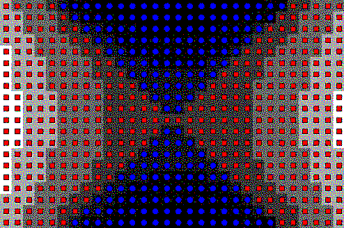
Finally, vector fields are rendered employing
oriented glyphs. Figure 6a shows a traditional hedgehog plot of a vector field
associated with the z = sin(x)cos(y) surface. It is rendered again in Figure 6b with a solid
rectangle. The thick rectangle enhances the contrast between object and
background, making recognition easier. A rectangle provides greater surface
area than the hedgehog for the addition of color, as can be seen in Plate 6c.
Plate 6d shows the vector field with a different glyph.
|
Figure 6a. Hegehog plot of z
= sin(x)cos(y). |
Figure 6b. Rectangular glyph plot of z = sin(x)cos(y). |
4. DISCUSSION
Op-Glyph was designed to provide a
user with complete freedom to visually represent data. Visual manipulation of
data, the ability to readily transform it, turn it over in the mind’s eye, is
an integral part of the data analysis process. Yet, complete control comes with
a cost. Many images created may violate rule of color and representation, and
may produce artistically garish results. For example, Plate 7a contains a
reference image of a complex superposition of sine waves at 900x600 resolution
rendered with a 32 shade colormap. Plate 7b shows the same function using a
30x20 grid of patches. Here the surface details are barely perceptible.
Superimposing a rectangular glyph atop the surface to show its curvature
creates an artistically interesting image but no structure (Plate 7c). Changing
the glyph to an oriented square the same size as the patch brings out the
surface structure (Plate 7d). Without the ability to manipulate the visual
representation at will, the final image would not have been found.
The process of creating all images was trial-and-error: varying colormaps, edge colors, background, and patch properties. Many combinations of representations give viable visualizations. The images presented here are a small subset of a much larger sampling. Both color and black and white produce good images, but the simplicity of black and white and the fact it that maximizes luminance contrast, gives it an edge over color. In particular, Figures 3d, 5a, and 6b elicit a quick perceptual response for shape and contour recognition. The shaded images (Figures 3f and 5b) require more time to review, but are more representative of the shaded contour surface (Figure 3a). Color allows more creativity. Plate 4 shows two images with surface patches in shades of gray and glyphs in two colors. The glyphs act as textures, giving the discontinuous surface patches continuity. They also provide a binary cue for upper and lower surface features.
In conclusion, the images created by Op-Glyph give a
good representation of surface shape and contour even with small data samples.
And the small images rendered in few colors with simple glyphs can be readily
visualized.
5. FUTURE WORK
Op-Glyph may be expanded in a number
of ways. First, the simple r,g,b color model can be replaced with a perceptual
color space. Second, a glyph creator-editor would allow the user complete control
over creativity. Finally, Op-Glyph was not only built as an experiment to test
the capabilities of glyph-based visualization of height field data, but also as
a test of how well low resolution data maybe displayed. These positive results
suggest that the next step be taken – porting the system to a PDA system. We
are actively pursuing this extension.
6. ACKNOWLEDEGMENTS
This work was supported by Pace University’s Center for Advanced Media. The author would like to thank Dr. Susan Merritt, Dean of the School of Computer Science and Information Systems, for her continued support.
7. REFERENCES
[1]
Corrin, L., Kudielka,
R., and Spalding, F. Bridget Riley:
Paintings from the 1960s and 70s. Serpentine Gallery, London, 1999.
[2]
Daily, M., Jerald, J.,
Lee, C., Martin, K., McInnes, D., Tinker, P., and Smith, R.C. Distributed Design
Review in Virtual Environments. In Proceedings
of the Third International Conference on Collaborative Virtual Environments,
CVE2000. (San Francisco, California, 2000).
[3]
Ebert, D.S., Rohrer,
R.M., Shaw, C.D., Panda, P., Kukla, J.M., and Roberts, D.A. Procedural Shape
Generation for Multi-dimensional Data Visualization. In Data Visualization ’99, Springer-Verlag, Wien, 1999, 2-12.
[4]
Ebert, D.S., Kukla,
J.M., Shaw, C.D., and Zwa, A. Automatic Shape Interpolation for Glyph-based
Information Visualization. In IEEE
Visualization’97 Hot Topic. (Phoenix, AZ, 1997).
[5]
Gooch, B., and Gooch,
A. Non-Photorealistic Rendering, A.K.
Peters Ltd.; 2001.
[6]
Healy, C.G., Booth,
K.S., and Enns, J.T. High-Speed Visual Estimation Using Preattentive Processing.
ACM Transactions on Human-Computer Interaction
3, 2 (1996), 107-135.
[7]
Healey, C.G.
Formalizing Artistic Techniques and Scientific Visualization for Painted
Renditions of Complex Information Spaces. In Proceedings of International Joint Conference on Artificial Intelligence,
2001.
[8]
Healy, C., Interrante,
V., Kremers, D., Laidlaw, D. and Rheingans, P. Nonphotorealistic Rendering in
Scientific Visualization. SIGGRAPH 2001
Course #32, ACM, 2001.
[9]
Interrante, V., Fuchs,
H., and Pizer, S. Enhancing Transparent Skin Surfaces with Ridge and Valley
Lines. In Proceedings of IEEE
Visualization ’95. (October, 1995), 52-59.
[10] Joy, M. Vasarely.
Neuchâtel: Editions du Griffon, Neuchâtel, 1965.
[11] Kirby, R.M.,
Marmanis, H., and Laidlaw, D.H. Visualizing Multivalued Data from 2D Incompressible
Flows Using Concepts from Painting. In Proceedings
of IEEE Visualization ’99. (October, 1999), 333-340.
[12] Kraus, M., and Ertl, T. Interactive Data Exploration
with Customized Glyphs. In Proceedings of
WSCG’01. 2001, 20-23.
[13] Krebs, A.M., Dorohonceanu, B., and Marsic, I.
Collaboration using Heterogeneous Devices – From 3D Workstations to PDAs. In Proceedings of the 4th IASTED
International Conference on Internet and Multimedia Systems and Applications
(IMSA’2000). (Las Vegas, NV, 2000), 309-313.
[14] Manaster, C.J., Nanthakumar, E., and Morin, P.A.
Detecting Null Alleles w ith Vasarely Charts. In Proceedings of IEEE’99. 1999.
[15] Marsic, I. Adaptive Collaboration for Wired and
Wireless Platforms. IEEE Internet
Computing 5, (July/August 2001),
26-35.
[16] Parola, R. Optical
Art: Theory and Practice. Dover Publications, Inc., Mineola, NY, 1996.
[17] Shaw, C.D., Hall, J., Blahut, C., Ebert, D.S., and
Roberts, D.A. Using Shape to Visualize Multivariate Data. InCIKM’99 Workshop on New Paradigms in
Information Visualization and Manipulation. (November, 1999).
[18] Treavett, S.M.F., and Chen, M. Pen-and-Ink Rendering
in Volume Visualization. In Proceedings
of IEEE Visualization 2000. (October, 2000), 203-20.
[19] Ware, C.
Information Visualization: Perception and Design, Academic Press, San
Diego, CA, 2000.
[20]
Weigle, C., Emigh, W.,
Liu, G., Taylor II, R.M., Enns, J.T., and Healey, C.G. Oriented Sliver Textures:
A Technique for Local Value estimation of Multiple Scalar Fields. In Proceedings of Graphics Interface 2000.
2000, 163-170.