|
Visualization |
Visualization refers to both process and product
- Visualization as process, defines “the act of
forming a mental vision, image, or picture of (something not visible or
present to the sight, or of an abstraction)”
- Visualization as product, refers to an artifact,
usually graphical, that represents data.
Visualization is a form
of computing the goal of which is to arouse consciousness and insight.
- It transforms data
for easier assimilation by an individual’s senses, typically sight.
- Visualization
algorithms restructure numerical and symbolic data into perceivable forms.
- This means that
visualization must be concerned with those mechanisms within humans and
computers that allow the perception, use and communication of sensory
information.
Foundational Fields:
- computer graphics
- computer vision
- computer science
- human computer
interaction
- art and design
- cognitive science
and artificial intelligence
Computer supported
visualization -
complex data is mapped to perceptual representations in such a way as to
maximize human understanding and communication.
Goal of computer visualization is to
engender a deeper understanding of information, physical phenomena or the
underlying processes related to them.
Brief History
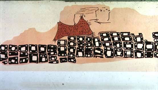
c. 6200 BC - The oldest known map? - Museum at
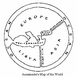
c. 550 BC - The first
world map? (described in books II and IV of Herodotus' “Histories” -
Anaximander of
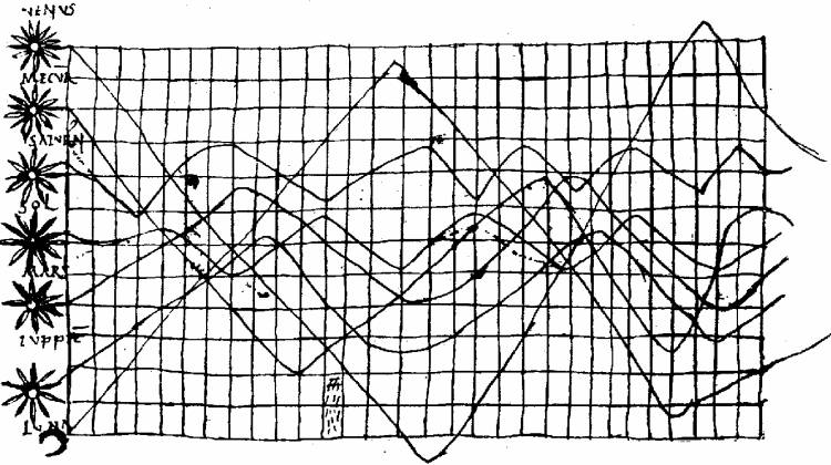
c. 950 - Earliest known attempt to show changing values
graphically (positions of the sun, moon, and planets throughout the year)-
c. 1350 - Proto-bar
graph (of a theoretical function), and development of the logical relation
between tabulating values, and graphing them (pre-dating Descartes). Nicole
Oresme (Bishop of Lisieus) (1323-1382),proposed
the use of a graph for plotting a variable magnitude whose value depends on
another, and, implicitly, the idea of a coordinate system.
Age of the Enlightenment mid- 1600s
to about 1880.
1637 - Coordinate system reintroduced in mathematics,
analytic geometry; relationship established
between graphed line and equation-Pierre de Fermat (1601-1665)
and René Descartes (1596-1650),
1660 - Robert Boyle
invents the air pump
1663 - Automatic recording device (the weather clock) producing a moving graph of temperature and wind
direction (in polar coordinates)- Christopher Wren (1632-1723),
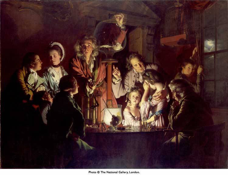
An
Experiment on a Bird in the Air Pump – 1768, Joseph WRIGHT of
A travelling scientist is shown
demonstrating the formation of a vacuum by withdrawing air from a flask
containing a white cockatoo, though common birds like sparrows would normally
have been used. Air pumps were developed in the 17th century and were
relatively familiar by Wright's day. The artist's subject is not scientific
invention, but a human drama in a night-time setting.
The bird will die if the demonstrator
continues to deprive it of oxygen, and Wright leaves us in doubt as to whether
or not the cockatoo will be reprieved. The painting reveals a wide range of
individual reactions, from the frightened children, through the reflective
philosopher, the excited interest of the youth on the left, to the indifferent
young lovers concerned only with each other.
The figures are dramatically lit by a single
candle, while in the window the moon appears. On the table in front of the
candle is a glass containing a skull.
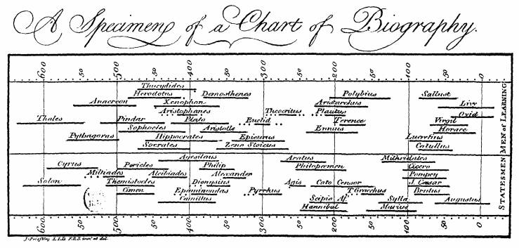
1765 - Historical timeline (life
spans of 2,000 famous people, 1200 B.C. to 1750 A.D.), quantitative comparison
by means of bars- Joseph Priestley (1733-1804),
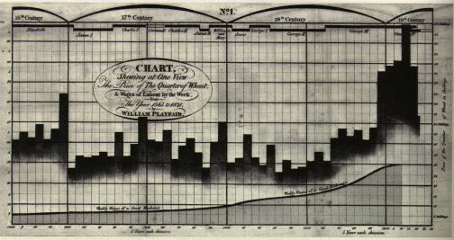
1767-1796 - Repeated systematic application of graphical
analysis (line graphs applied to empirical measurements) - Johann Heinrich
Lambert (1728-1777),
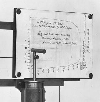
1796 - Automatic recording of bivariate data (pressure vs. volume in steam engine) ``Watt
Indicator,'' (invention kept secret until 1822)- James Watt (1736-1819) and John Southern ,
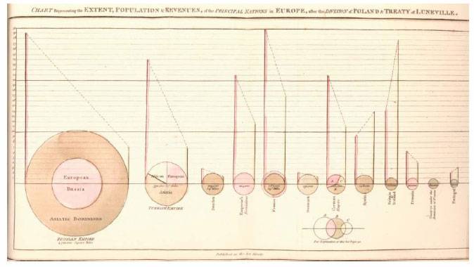
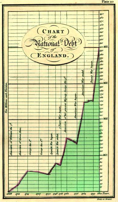
1786 - Bar chart, pie, area charts, and line graphs of
economic data- William Playfair (1759-1823) –
Father of Information
1798 -Invention of lithographic technique for printing of maps and diagrams - Aloys Senefelder (1771-1834),
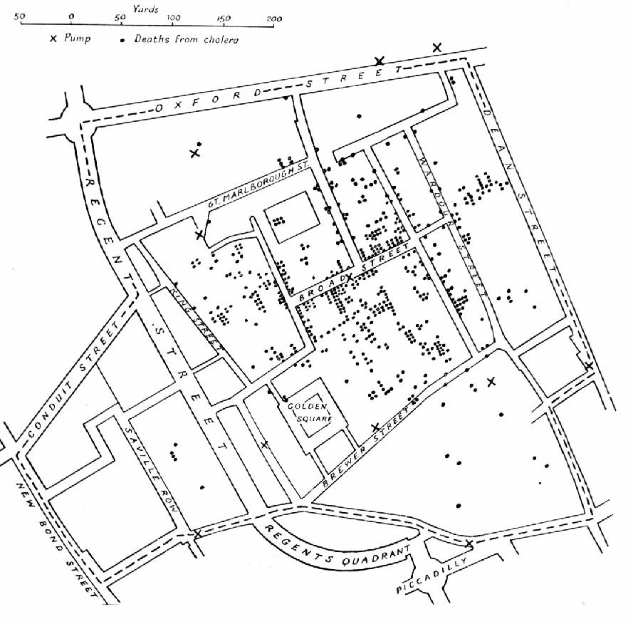
The 1854
- Dr.
John Snow's map of deaths from a cholera outbreak in London, 1854, in
relation to the locations of public water pumps.
- Snow
observed that cholera occurred almost entirely among those who lived near
(and drank from) the
- He
had the handle of the contaminated pump removed, ending the neighborhood
epidemic which had taken more than 500 lives
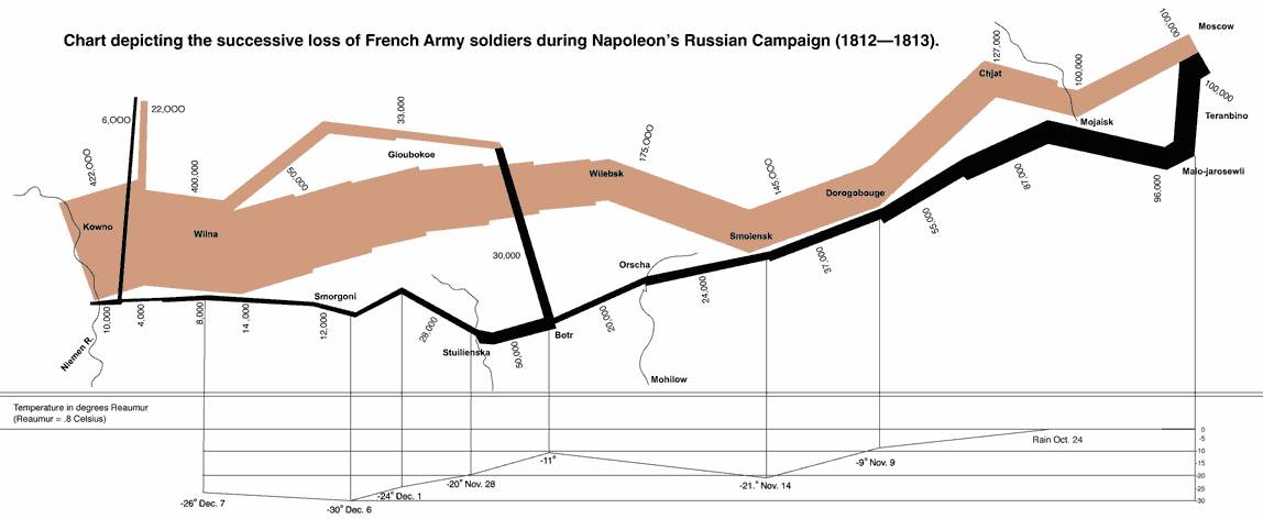
Charles Joseph Minard's Napoleon map of 1861
Field of
Visualization
Segmented into five general categories:
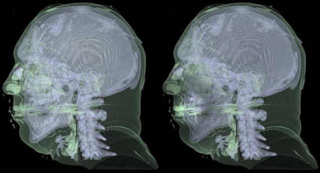
- Scientific - focuses on spatially correlated data generated by scientific
processes whether experiment or theory
- Scientific
visualization helps understanding physical phenomena in data
- Mathematical
models play an essential role
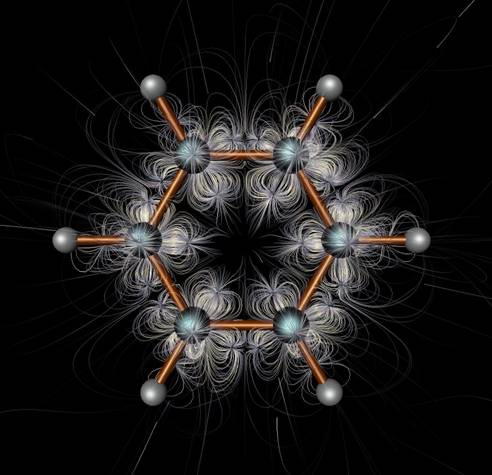
e.g. molecular structures
- Information - process of transforming data and information that are
considered to be abstract, not inherently spatial, into a visual form
- Information
visualization helps users identify patterns, correlations, or clusters
e.g. ages, weights, birth dates, salaries
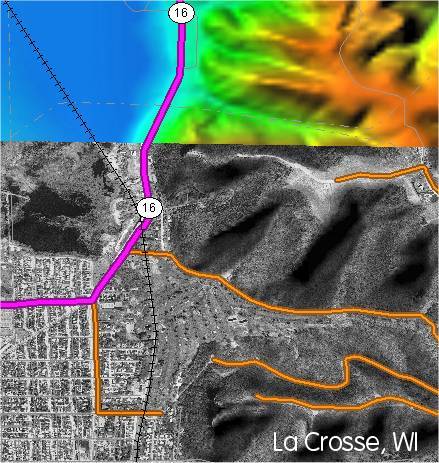
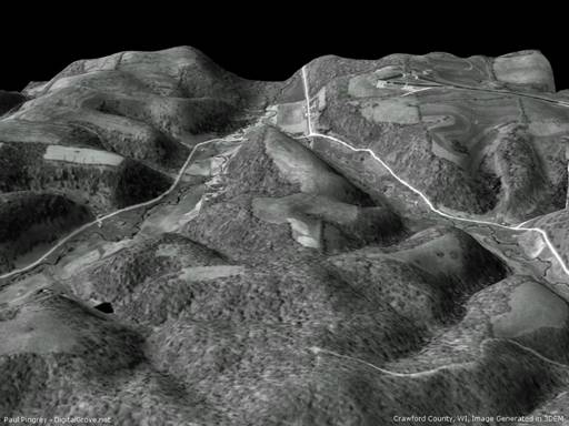
- Cartographic-geographic - process transforms geospatial data to create
maps for presentation and exploration
- Techniques span
both scientific and information visualization.
- They are
scientific because their underlying geospatial data is the physical
substrate upon which abstract information is displayed.
- Exploratory Visualization - no prior knowledge of the data is assumed -
the task is to explore data to understand what’s in it.
- Knowledge visualization - subsumes above modalities by exploring the
use of visual representations to improve the creation and transfer of
knowledge among groups.
·
Knowledge
visualization processes are employed to transfer insights, experiences,
attitudes, values, expectations, perspectives, opinions and predictions, so as
to enable others to re-construct, remember and apply insights correctly.
·
Examples of knowledge visualization formats
are:
o
heuristic
sketches (e.g., ad-hoc drawings of complex ideas)
o
conceptual
diagrams
o
visual
metaphors (such as Plato’s cave metaphor of reality)
o
animations
(such as a rotating double helix)
o
knowledge maps
(such as a landscape of in-house experts)
o
domain
structures (e.g., a co-citation network of knowledge management literature).
·
All these
formats capture not just (descriptive) facts or numbers, but prescriptive and
prognostic insights, principles, and relations.
Seven stages of visualizing data — acquire, parse, filter, mine, represent, refine,
and interact
- • Acquire – Obtain the data, whether from a file on a disk or a source over
a network.
- • Parse -
Provide some structure for the data’s meaning, and order it into
categories.
- • Filter – Remove all but the data of interest.
- • Mine –
Apply methods from statistics or data mining as a way to discern patterns
or place the data in mathematical context.
- • Represent – Choose a basic visual model, such as a bar graph, list or tree.
- • Refine – Improve the basic representation to make it clearer and more
visually engaging.
- • Interact – Add methods for manipulating
the data or controlling what features are visible.
Scientific Visualization
Process - Haber and McNabb
Visualization process is series of transformations
to convert raw simulated data into a displayable image:
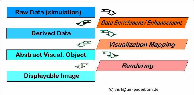
The visualization pipeline
describes the process of creating visual representations of data
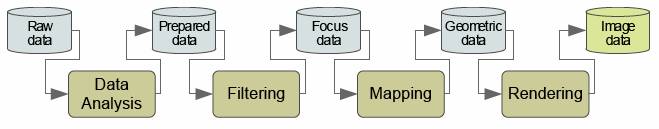
Card, S., Mackinlay, J., Shneiderman, B. (1999).
- Data Analysis: data
are prepared for visualization (e.g., by applying a smoothing filter,
interpolating missing values, or correcting erroneous measurements) --
usually computer-centered, little or no user interaction.
- Filtering: selection
of data portions to be visualized -- usually user-centered.
- Mapping: focus data
are mapped to geometric primitives (e.g., points, lines) and their
attributes (e.g., color, position, size); most critical step for achieving
Expressiveness and Effectiveness.
- Rendering: geometric
data are transformed to image data.
Scientific Visualization
Data Types
•
Topology
–
structure, connectivity
•
Geometry
–
shape
•
Variables
–
temperature,
pressure, velocity
•
Metadata
–
information
about data, e.g., initial conditions, data of observation
Data Topologies
•
Data can be
–
structured (e.g., gridded data)
–
unstructured (e.g., finite element data)
–
a combination of both.
•
Data can
have different dimensions, both spatial and computational.
Data Representation Types
•
Scalar
–
volume
–
isocontour
–
height field
–
scatter plot
–
image
–
contour plot
–
strip chart
•
Vector
–
ribbon
–
particle
traces
–
arrow plot
•
Tensor
–
disk and shaft
ellipsoid
•
Multivariate
–
various
glyph shapes
Visualization Techniques
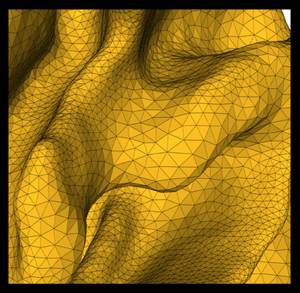
1. 2D and 3D Plot/Graphs - Tables and Stacked Plots,
Scatter plots
2. Contour Lines/Isosurfaces
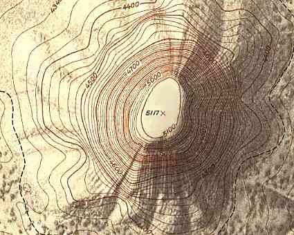 Contour Lines
 Isosurface
 Contour
Surface
Contour
Surface
3. Color Shading
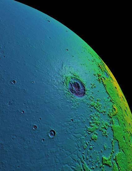 Color Shading / False Color
4. Glyphs (Geometric Shapes)
5. Vector Fields
- Arrows, Streamlines, Particle Tracing
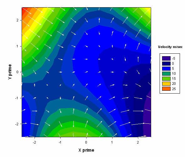 2D Vector Field
 3D Vector Field
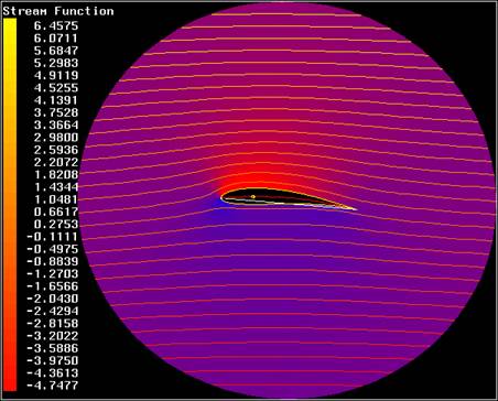 Streamlines
 3D streamlines
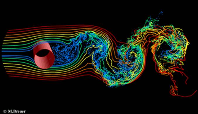 Particle Tracing
6. Adding Textures
 Texture Map Terrain model
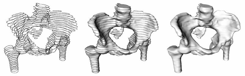
7. Volume Visualization
User Interfaces for the Visible Human Project
8. Animation
9. Data Sonification
An Illustrated
Analysis of Sonification for Scientific Visualisation
Selected Examples of DNA Music
Andrea
Polli – paper
1. Virtual Reality
Virtual REALITY :
SCIENTIFIC AND TECHNOLOGICAL CHALLENGES (Book)
Information Visualization - Overview
Data Representation Types
•
1-D Linear Document Lens, SeeSoft, Info Mural,
Value Bars
•
2-D Map GIS, ArcView, Medical imagery
•
3-D World CAD, Medical, Molecules,
Architecture
•
Multi-Dimension Parallel Coordinates, Spotfire,
XGobi, Visage, Influence Explorer,
TableLens, DEVise
•
Temporal Perspective Wall, LifeLines,
Lifestreams, Project Managers, DataSpiral
•
Tree Cone/Cam/Hyperbolic, TreeBrowser,
Treemap
•
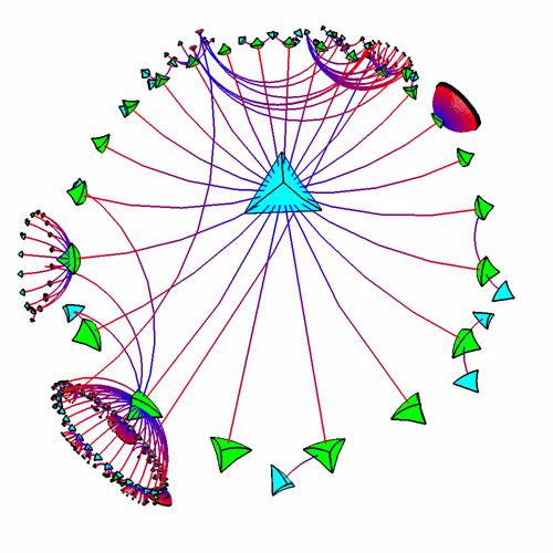
Network Netmap, netViz, SeeNet, Butterfly,
Multi-trees
•
1-D - represent
information as one-dimensional visual objects in a linear or a manner
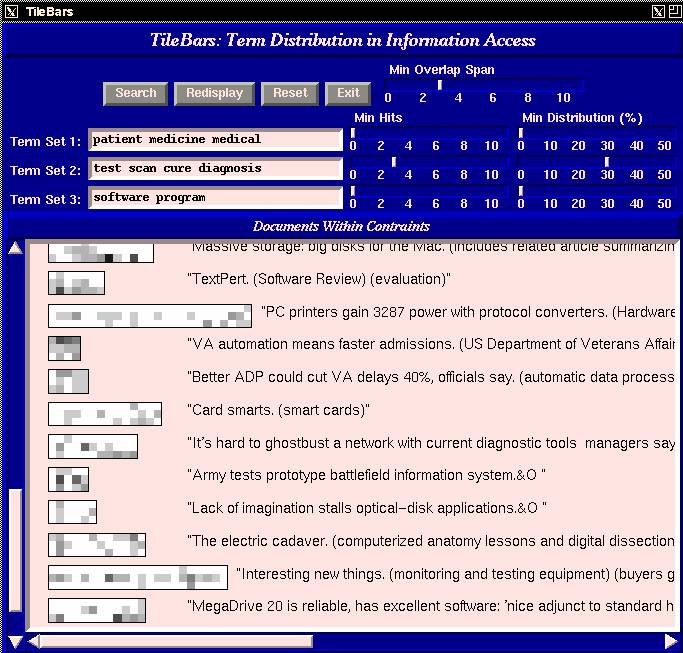
e.g TileBars
Marti Hearst, TileBars: Visualization of Term Distribution
Information in Full Text Information Access, Proceedings of the ACM
SIGCHI Conference on Human Factors in Computing Systems(CHI), pp. 59-66,
Denver, CO, May 1995. - PDF
·
The TileBars interface
is an attempt to show the user, graphically, the relationship between the words
in the query and the documents retrieved.
·
Each large
rectangle indicates a document, and the relative lengths of the rectangles
correspond to the relative lengths of the documents.
·
The darker the
segment or tile, the more frequently the query term occurs in that part of the
document
e.g.
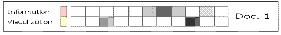
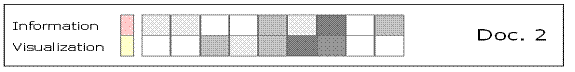
·
The upper row indicates the frequency of the word "Information" in each section of
the document
·
The lower row
corresponds to the same concept for "Visualization".
•
In document 1 there's
no section of the text where you can find simultaneously the two words
•
In document 2, shorter
than doc. 1, there are three sections where both words coexist, showing
"Information Visualization" related data.
e.g. Fisheye Menus
•
2-D
e.g. pie charts, bar
charts, etc
•
3-D
•
WebBook system folds web pages into three-dimensional books
Card,
S. K., Robertson, G. G., and
•
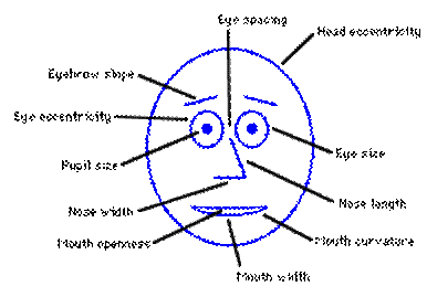
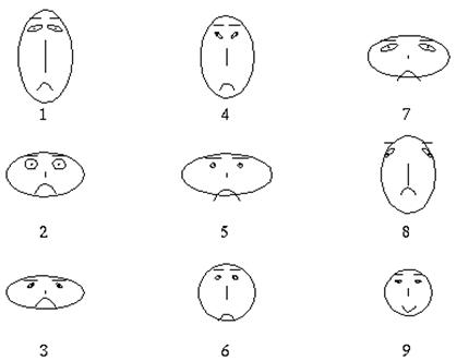
Multidimensional
Glyphs - e.g. Chernoff Faces
|
|
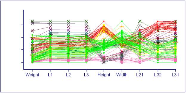
e.g. Parallel Coordinates
·
A parallel coordinates
plot is a graphical data analysis technique for plotting multivariate data.
·
Since plotting
more than 3 orthogonal axis is impossible, parallel coordinate schemes plot all
the axes parallel to each other in a plane.
·
In the parallel
coordinates plot, a set of parallel axes are drawn for each variable. Then a
given row of data is represented by drawing a line that connects the value of
that row on each corresponding axis.
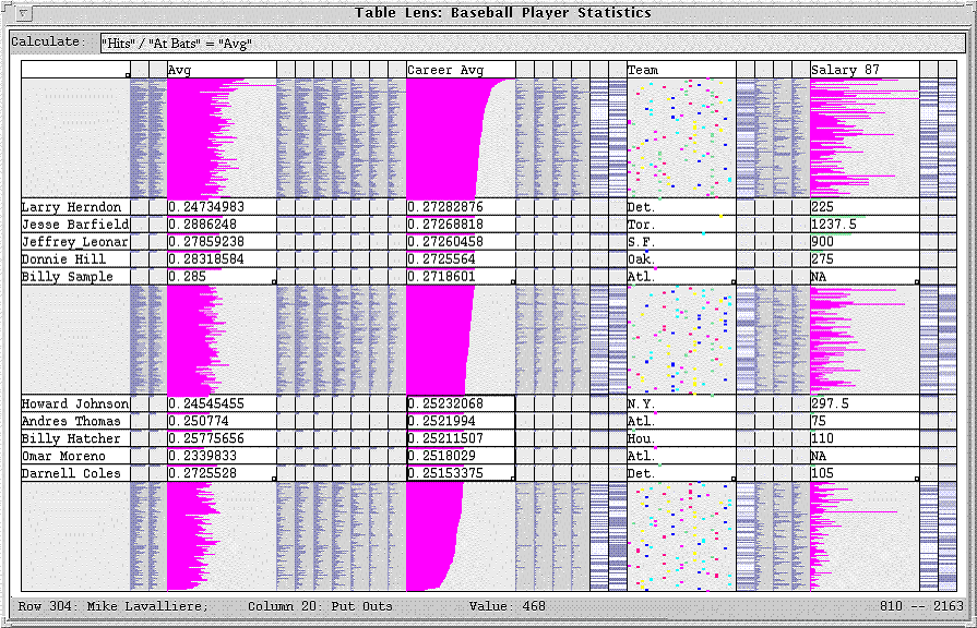
e.g Multidimensional Tables
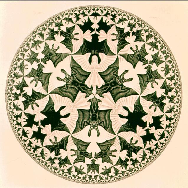
e.g. Hyperbolic Tree –
·
Hyperbolic
Browser, where the space itself is distorted into hyperbolic coordinates (then
projected back into the Euclidean plane).
·
Since the space
expands exponentially, it is a good place to lay out exponentially-expanding
graphs, such as trees.
Hyperbolic
Multi-Dimensional
Scaling and Interactive Visualization of
High-dimensional Data
Hyperbolic space - Wikipedia
M.C.Escher
Douglas
Dunham’s discussion of Escher’s work - PDF
WebOOGL system
Munzner,
T. and Burchard, P. 1995. Visualizing
the structure of the World Wide Web in 3D hyperbolic space. In Proceedings
of the First Symposium on Virtual Reality Modeling Language (San Diego,
California, United States, December 13 - 15, 1995). VRML '95. ACM,
Lamping,
J., Rao, R., and Pirolli, P. 1995. A focus+context
technique based on hyperbolic geometry for visualizing large hierarchies.
In Proceedings of the SIGCHI Conference on Human Factors in Computing
Systems (Denver, Colorado, United States, May 07 - 11, 1995).
e.g. TreeMaps
·
Shneiderman, B.
1992. Tree visualization with tree-maps: 2-d space-filling approach. ACM
Trans. Graph. 11, 1 (Jan. 1992), 92-99. - PDF
· Trees can also be visualized as nested spacefilling, enclosures called Tree-Maps.
·
At one level in
a tree, the children of a node divide up the X dimension of the
visualization, at the next level they divide up the Y dimension of the node in
which they are enclosed.
·
The division
proceeds alternating between X and Y until the leaves of the tree
are reached.
·
This method uses
all of the space. An example showing the use of space by the Mac filing system
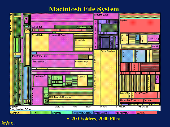
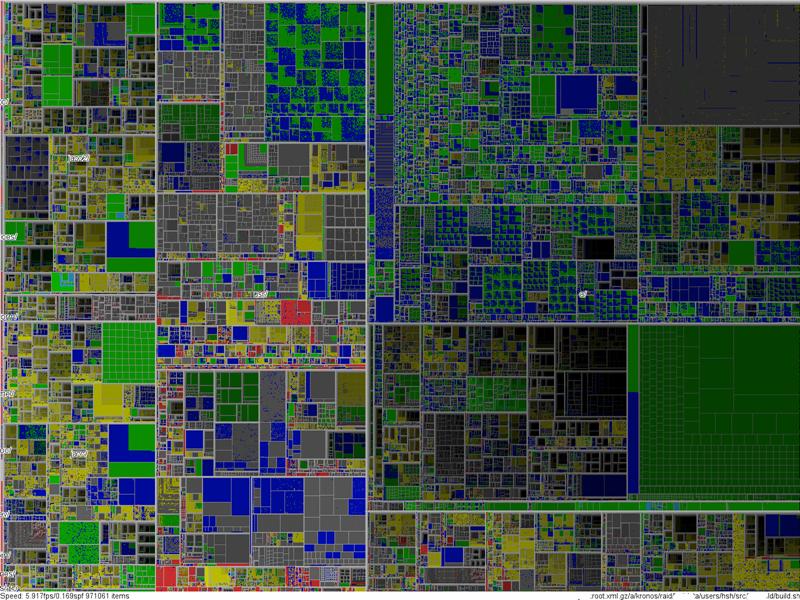
Treemaps for
space-constrained visualization of hierarchies
Stockmarket Treemap - http://www.smartmoney.com/map-of-the-market/
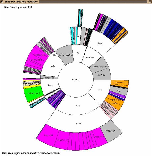
e.g. SunBurst
·
Items in a
hierarchy are laid out radially, with the top of the hierarchy at the center
and deeper leves farther away from the center.
·
The angle swept
out by an item and its color correspond to some atttribute of the data.
·
For instance, in
a visualization of a file system, the angle may correspond to the
file/directory size and the color may correspond to the file type.
·
An example
Sunburst display is shown below.
•
Networks